Tool of thirds
Want a simple, classic design principal that will instantly make your pictures more dynamic and interesting? The rule of thirds is it.
What’s the Rule of Thirds?
Imagine a picture frame; draw two evenly spaced lines across it from left to right, then another two from top to bottom to make 9 equal rectangles. Drawing the viewer’s eye to the four points where those lines intersect creates drama and interest in your picture, and that’s the rule of thirds.
Most often, when we snap a picture we put our spouse, or that olive tree, church… whatever… dead center in the frame. That’s not bad, but it’s easy for the viewer to glance at the middle of the picture and move on. Instead, try moving your subject to the left third, or the right third and you’ll already give your viewer more to look at.
A picture is worth a thousand words, right? So this should help:
Examples
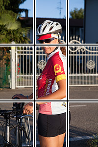
You just might recognize Cristina Taioli ; she’s led tours with us for a decade and a half! Here, she’s in the center of the frame. You look at her and move on.
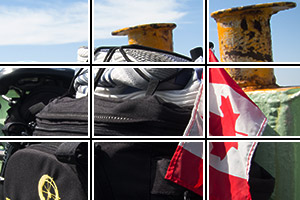
A couple of weeks ago, I accompanied a fun group (with four Canadians) on our Bike Across Italy: Venice to Pisa tour. Since there’s a lot of water around Venice, we take a couple ferries on our way out of town. This bright red Canadian flag caught my attention so I placed it along the right third of the frame.
Another time the rule of thirds comes in handy is for horizons. If the horizon cuts the sky (or land, sea, whatever…) in equal halves, it’s kind of boring. By simply tilting the camera up or down, you put the horizon on one of those lines and add more interest. You decide, is the sky or the land more interesting? Give that the big 2/3 and leave the smaller 1/3 for the less interesting part.
On that same Venice to Pisa tour, we visit Chioggia. Leaving town, I captured this bridge with the city in the background. The bridge and water are more interesting than the sky, so I gave them the majority of the frame.
Artists have used this “tool” for centuries, but credit goes to John Thomas Smith for first writing it down in 1797.
Exceptions
As with most rules, one reason to know about it is to know when to break it.
Since adding drama and tension to your photo are good reasons to use the rule of thirds, peacefulness and symmetry are two excellent examples of when you might want to leave this tool in its box. Picture, for example, a series of concentric arches, or a boat reflecting peacefully on the sea.
On a trip to Colorado this winter, I visited my home state of Colorado. This beautiful sunrise reflects nicely on the frozen lake. Here, the symmetry trumps the rule of thirds.
Another time to set aside this guideline? Whenever you want to, because it’s your photo and you can do what you want.
It’s up to you
It’s good to know the rule of thirds because it can often make stronger images. But once you know why to use it, you know when not to.
I’d rather call it the “Tool of Thirds,” because it’s a guideline… a helpful hint; not a rule.


